To make your application stand out, Apollux uses primary, info, success, warning, danger and muted custom color shades to allow you to easily customize the look and feel of your dashboard. By default, we use predefined colors from Tailwind CSS but you can easily change them by editing the tailwind.config.ts file.
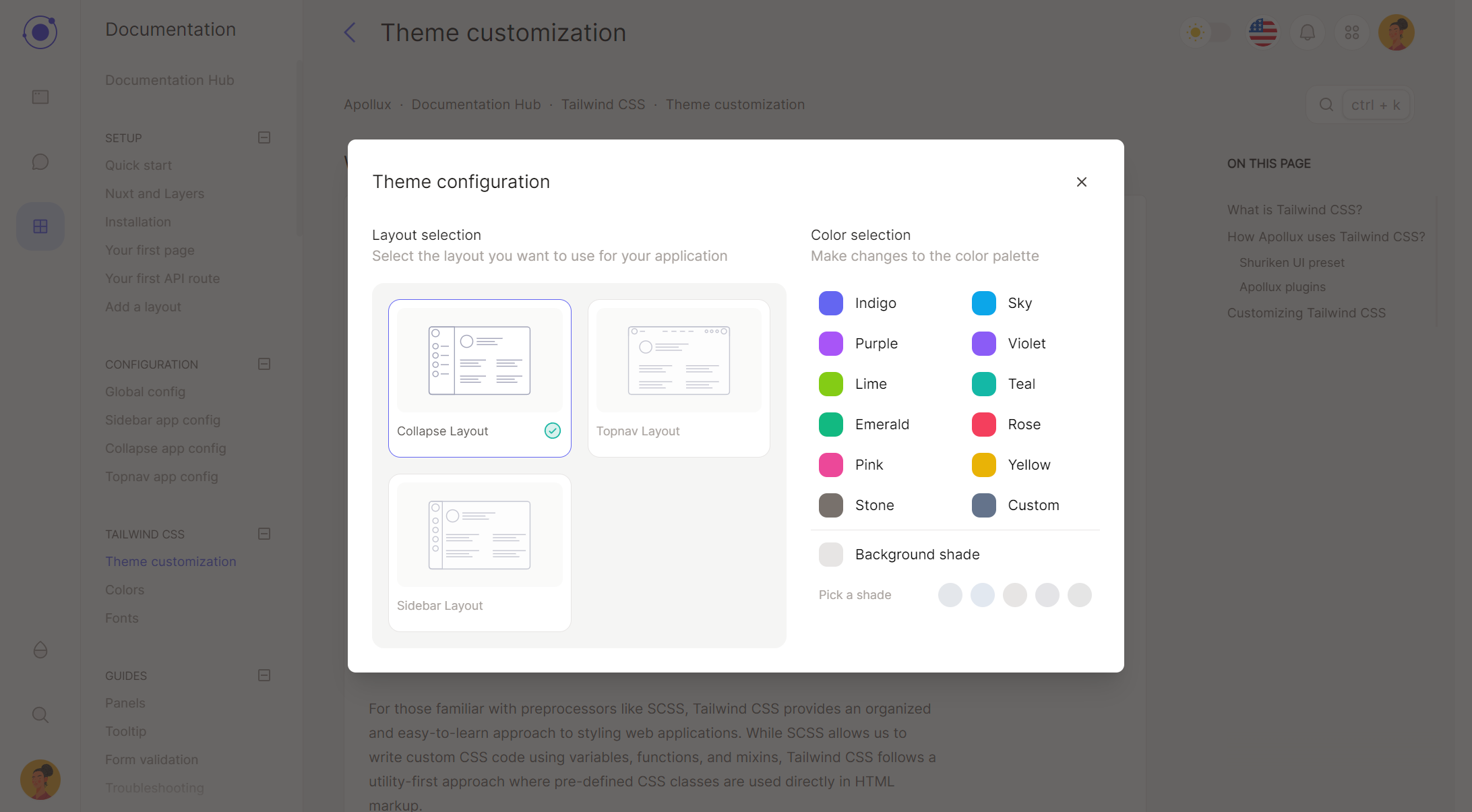
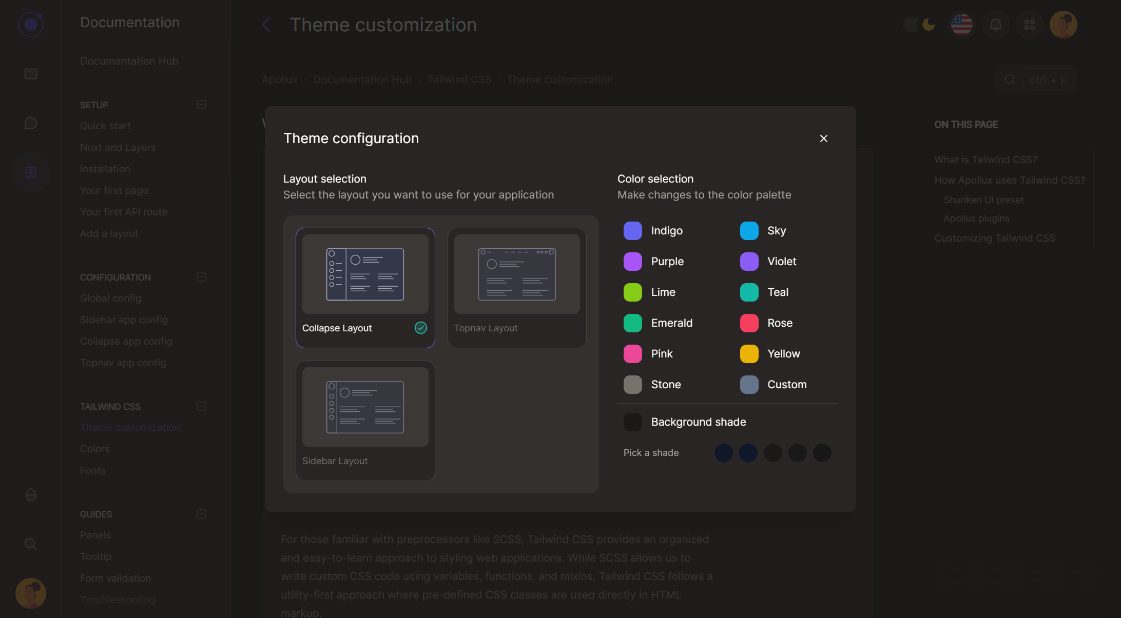
- Use the customizer : Open the Apollux theme customizer by clicking on the droplet icon in the navigation. You can dynamically change the layout between the three available (more in future updates). You can change the primary color using one of the presets but also the background color, by selecting one of the available shades. The customizer is a useful tool that let's you see your brand color in action.
Useful resources:
The primary color is the main color to establish brand recognition and familiarity of your application.
The muted color is used to create a contrast between the primary color, text and the background color. To make your app look good in dark mode, you should use a color that fit well with the primary color: example, if your primary color is red, you should use a warm gray color for the muted color.
The info color is the secondary color used to highlight important information.
The success color is the color shade used to highlight actions that have been completed successfully.
The danger color is the color shade used to raise attention to potentially dangerous actions or when something has gone wrong.
The warning color is the color shade used to highlight actions that need to be taken.